© Huseyynu
Say Hello
hi@politechaos.com
Hotline
+47 9824 554321
Branding Design
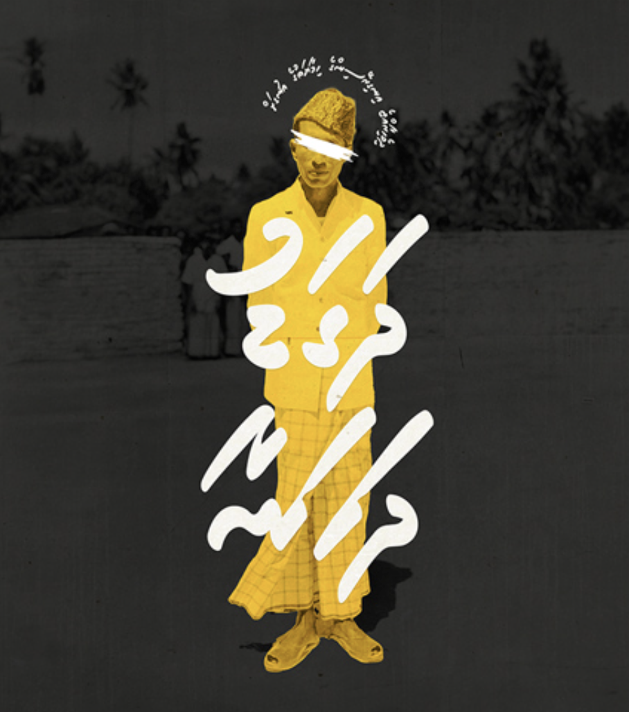
My home island, Fainu, is a small community of around 500 people, located on the eastern edge of Raa Atoll. At one point, the island council called on designers to create a brand identity that could bring everything together, give visitors a clear sense of the island, and most importantly, tell our story.
I had just come back after my studies and found myself with plenty of time to take on the project. It also felt very personal to me. Fainu is home, and design is the way I know best to express ideas, so it felt right to try and tell our story through it.
Across the Maldives, many islands are beginning to embrace local tourism. But in some places, over-tourism is starting to take away from the cultural identity of the islands. There is also a growing trend of branding islands purely around demand, focusing heavily on selling points in a very literal way. Fainu, however, is still a blank page when it comes to tourism. The council saw this as an advantage. There was an opportunity to build something from the ground up, an identity rooted in what Fainu truly is, rather than shaping it around what it could be sold as. The goal was to create something more authentic and genuine to the island.
Putting my bias aside, Fainu is often described by visitors as one of the most peaceful islands they have experienced. There is a long tradition of welcoming people in the warmest way. The island is home to some of the oldest trees in the country, and many of these large trees have joali swings beneath them where people can sit and relax. There is an old forest, plenty of vegetation, a beautiful house reef and beach, and a strong sense of safety that allows you to wander freely without worry.
All of these elements point toward a feeling of joy and happiness. At the same time, happiness is a word that gets used so often that it sometimes loses its meaning. Through discussions with the council, conversations with locals, and insights from people who have visited the island, I decided to explore happiness as the foundation of the brand. That is where the main idea, “Isle of Happiness,” came from, and it became the starting point for everything that followed.
To position Fainu as a truly happy island, the idea was to embed this feeling into everything. From the island’s identity to its activities, events, festivals, and all other applications of the brand, the goal was to reflect and share that sense of happiness. In doing so, it becomes more than just a concept. It becomes a way of life for both the people who live on the island and those who come to experience it.
Once the theme “Isle of Happiness” was set, it opened the way to start building the brand across different areas that needed to be explored in telling Fainu’s story. The idea was to shape something that could later be translated visually, but first it had to come from a real and honest understanding of the island.
The most important part was staying true to what Fainu actually is. That meant looking closely at the people, their livelihoods, and both the natural and built environments. Being born there helped, of course, but it also took a lot of digging into history and, more importantly, many conversations. Spending time talking to people, especially the older generation, gave a much deeper understanding of what truly defines Fainu.
There was a lot to explore. Old stories of people who lived on the island, the everyday relationship people have with the forest, even the names of different areas within it. The kinds of fruits and vegetation people grow and gather, how festivals are celebrated, the traditional activities people still practice, religious and cultural habits, and even how neighboring islands and visitors see Fainu. All of this came together as a wide range of themes.
To shape this into a clear and usable identity, five main pillars were defined. Together, they cover all of these aspects and form the foundation of the brand.
1. Tropical Bliss: Focuses on the rich natural beauty of Fainu and its sensory experience. The island is home to a vast, old forest filled with a wide variety of plant life, including the large Funa-faa trees and rows of Kaani trees that are over a hundred years old. There is also the vibrant house reef and the calm, beautiful beach. This pillar captures that feeling of color, life, and natural abundance that immediately draws people in.
2. Serene Islandness: Reflects the slow and peaceful rhythm of life on the island. It looks at the warmth of the people and their everyday lives, their customs and traditions, and the way they maintain a clean, calm, and welcoming environment. It is about a way of life that feels grounded, simple, and deeply connected to community and faith.
3. Eco-Harmony: Explores the relationship between the people of Fainu and their environment. It is about how they live alongside nature with care and respect. From farming and fishing to daily household practices and craftsmanship, there is a strong sense of balance in how natural resources are used. This pillar reflects a lifestyle that values sustainability and the long-term health of the island.
4. Joyful Living: Captures the social side of Fainu. It is about creating a space where people can live comfortably and openly, where neighbors are close, and where visitors are welcomed with genuine warmth. There is a strong sense of community, filled with laughter, shared moments, and a natural sense of happiness in everyday life.
5. Maldivian Authenticity: Highlights how Fainu continues to preserve and practice some of the country’s oldest traditions. From cultural festivals and local crafts to music, dance, and daily customs, these elements are still very much alive on the island. This pillar represents a deep connection to heritage and a commitment to keeping those traditions visible and meaningful.
After finalising the five pillars, I spent a lot of time exploring the visual direction. This meant looking into colours, forms, and different visual elements that could represent each pillar in a meaningful way. The colours were chosen based on both what they represent and the emotional connection they carry in relation to each pillar. Alongside that, I explored a range of graphic elements, eventually selecting one distinct element for each pillar that felt strongly rooted in Fainu’s identity.
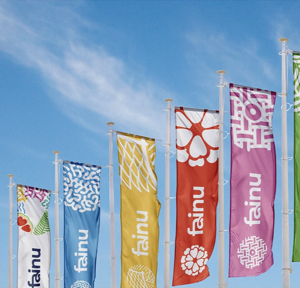
As the pillars became clearer and I looked into different approaches to community branding, I went through many sketches and visual styles. Over time, it became obvious that a single, straightforward logo wouldn’t be enough to capture Fainu or tell its story properly. Instead, I leaned towards a more colourful, expressive, and slightly maximalist approach. This led to the idea of creating five individual logos, each representing a pillar, which could also come together as one unified logo system.
Since the logo turned out quite colorful and leaned into a more hand-drawn, expressive style, I spent some time testing different typefaces alongside it. In the end, I chose something slightly more formal to balance things out. A lot of the branding would be used by the council, so it felt important to keep a level of structure and clarity.
That said, not everyone agreed with this direction. Some felt the type didn’t fully match the tone of the logo and came across as a bit different from the overall visual style.
In the end, the full logo system was brought together, combining all five pillars, each with its own colours and graphic elements, along with the logotype in both English and Thaana and the tagline “Isle of Happiness.” It was then finalised and approved by the Secretariat of the Fainu Council.
During the process, I also suggested using just “Fainu” instead of “Ra. Fainu” in most cases. The name felt strong enough on its own, and it made sense to keep it simple unless it was needed for official use. The council and the community were open to that idea.
The rollout of the branding was handled quite thoughtfully by the council and the island community. A large version of the logo was installed at the harbor entrance, and signage and a map using the new branding were placed around the island. Merchandise was produced and shared with visitors and guests, and the branding started to appear in public events through flags and decorations.
They also introduced a Fainu Day to bring the community together, along with an award night to recognise contributions from people in the island. Around the same time, a solar project was implemented that helped reduce fuel usage. A children’s park and a picnic beach were also opened, using the new brand colours. There was even a small community initiative encouraging households to paint and decorate their homes, with a few being recognised.
Overall, the branding was applied across different parts of the island in a relatively short time. It was satisfying to see it move beyond just a visual identity and be used in everyday settings.
ޖެހިގެން އިން މަޝްރޫޢު
MVR